A logo must be endlessly adaptable. It must have impact on a billboard and still be legible at under an inch high. Full color logos must translate to a single color.
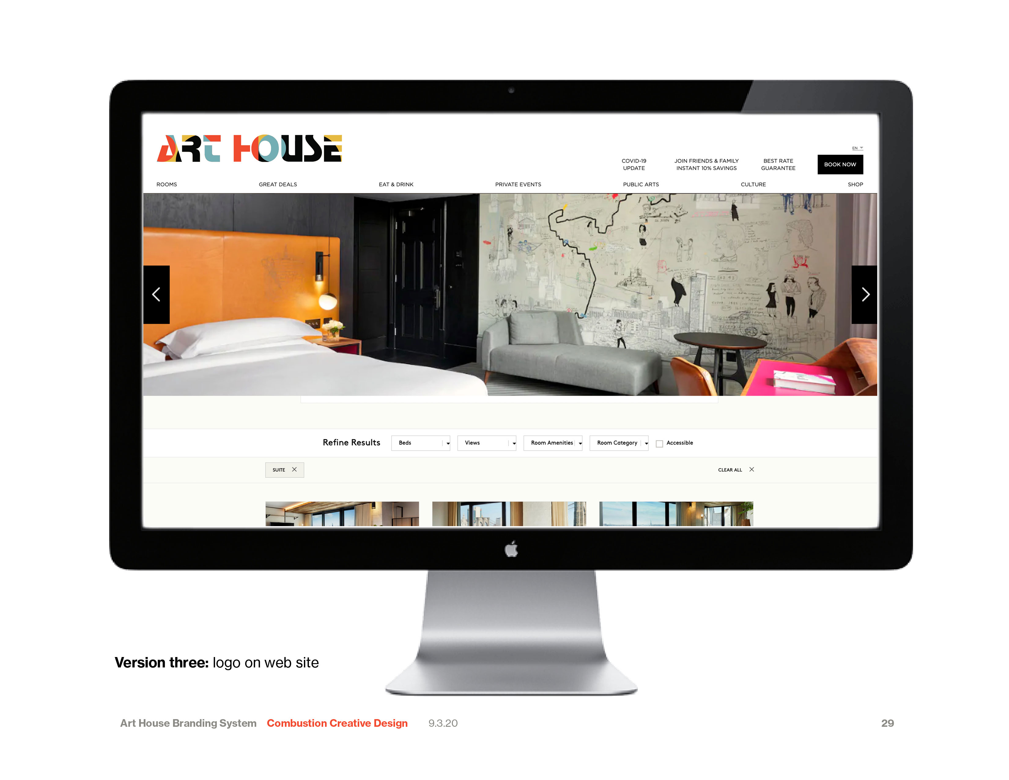
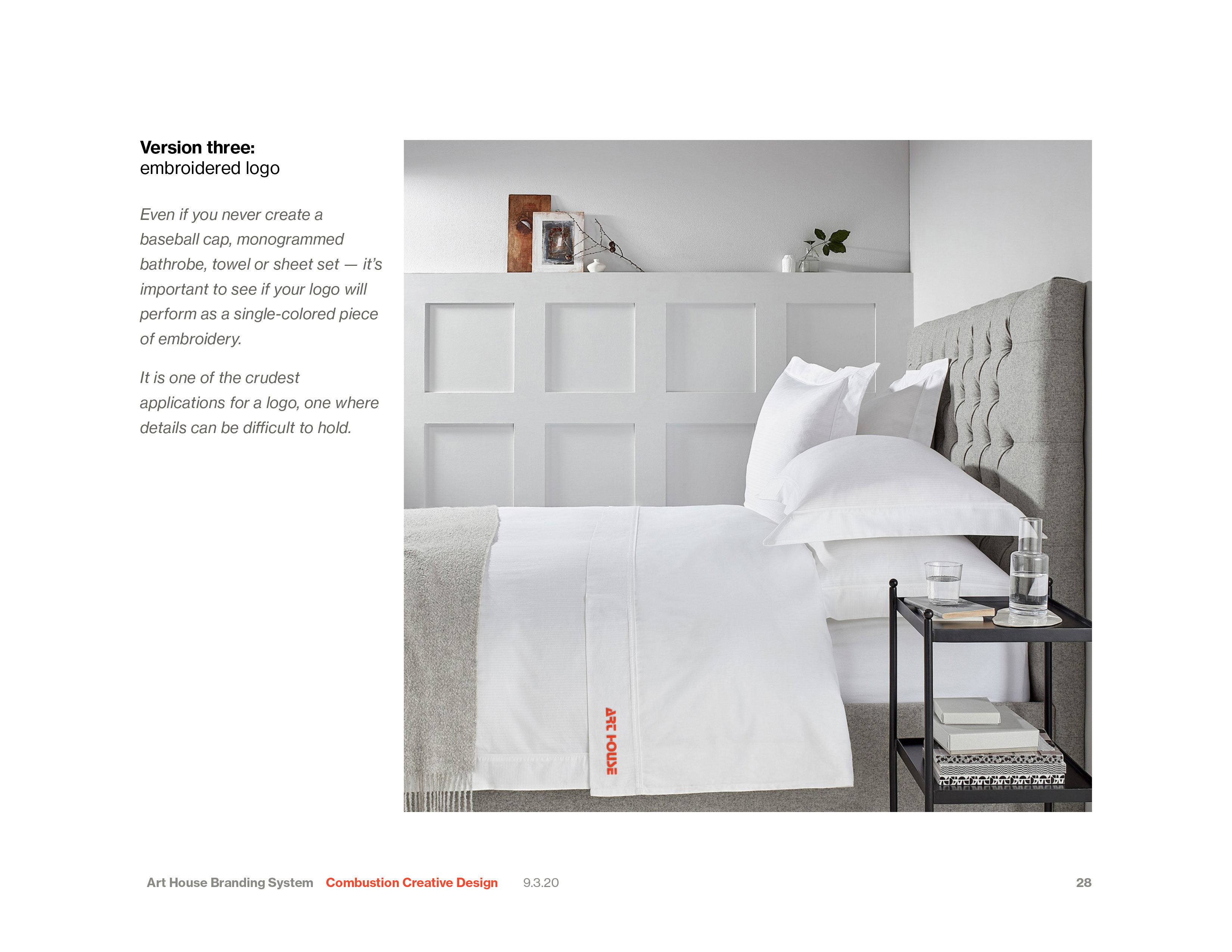
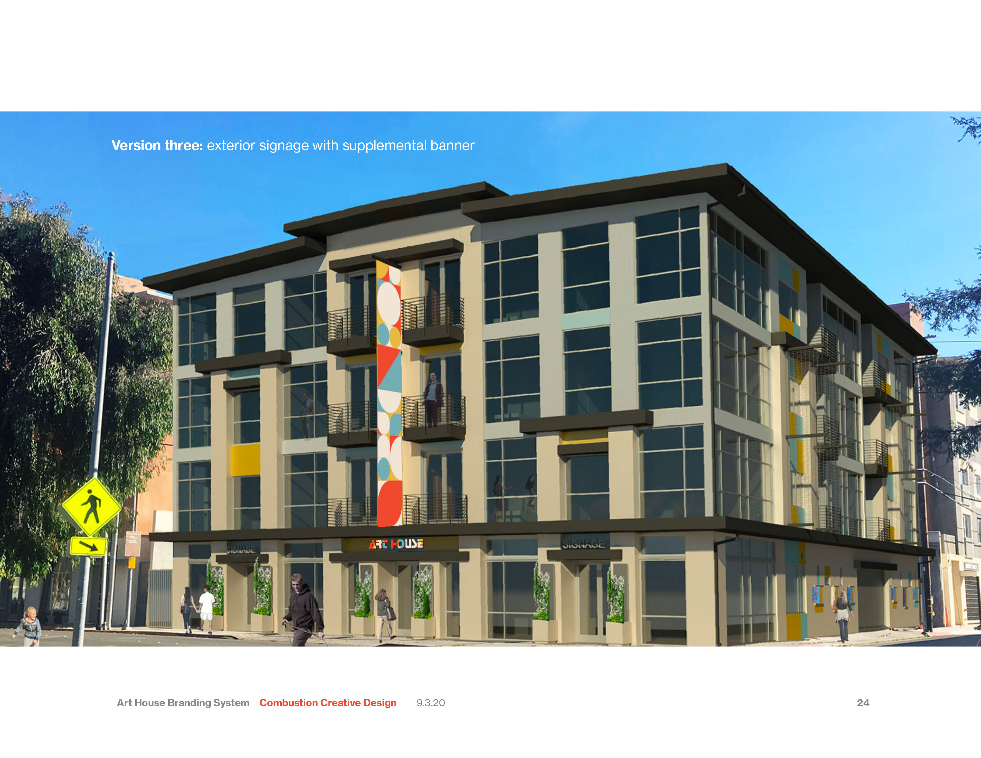
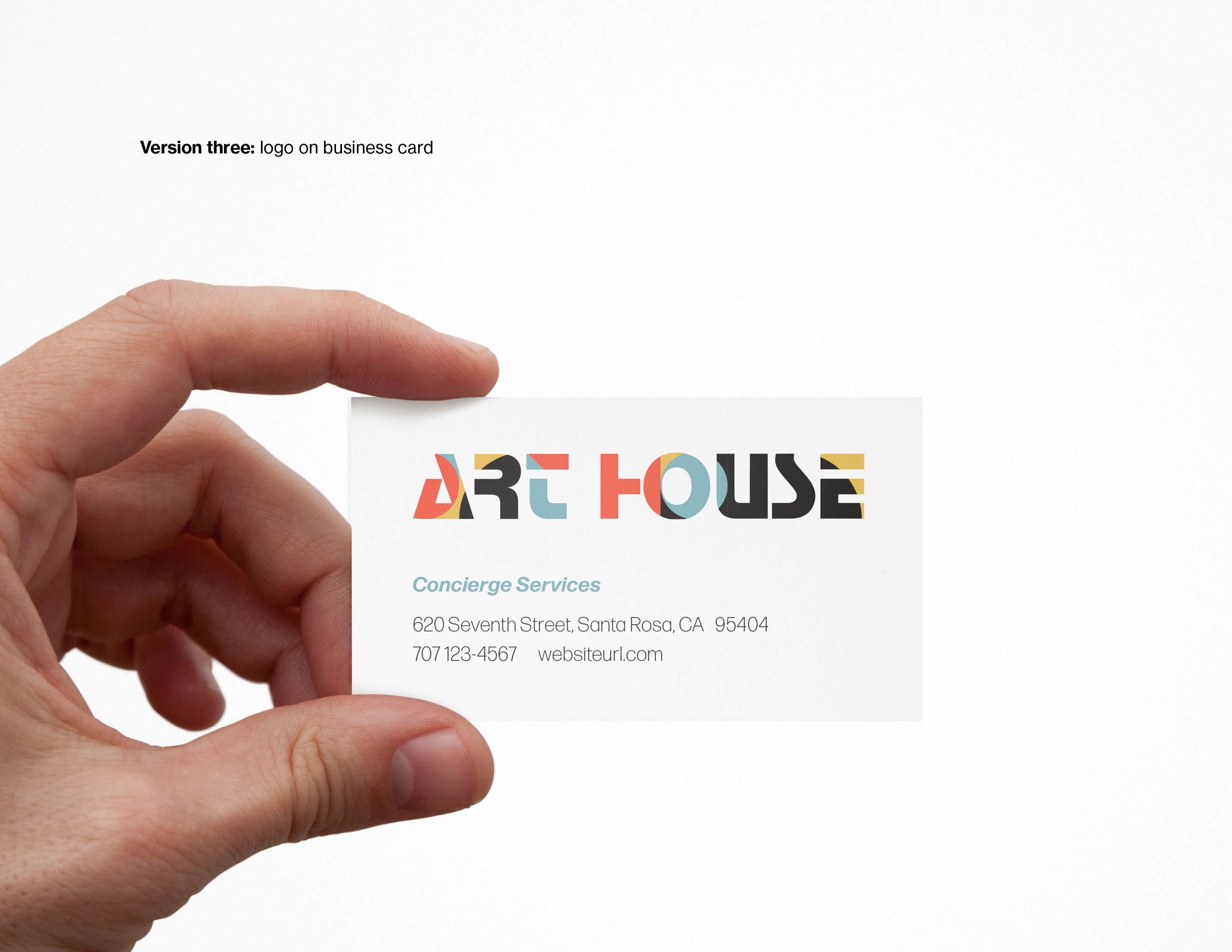
This recent branding system for Art Hotel in Santa Rosa illustrates my client presentation process. Each logo is shown in context.
The client is able to determine if the logo:
- works as a large sign
- is legible on a business card
- translates to a single color of embroidery
- fits easily at the top of a web page.
For this project, my brief was to create a branding system that embodied the name of the new hotel: Art House. The solid features of the building are reflected in the typography. The color palette amplifies the existing exterior colors.


