Sometimes the brief changes.
A young winemaker and distributor approached me for labels that they planned to call "Easy Rider", after the 1969 movie. They wanted to capture a certain spirit of America and planned to buy choppers to ride them across country.
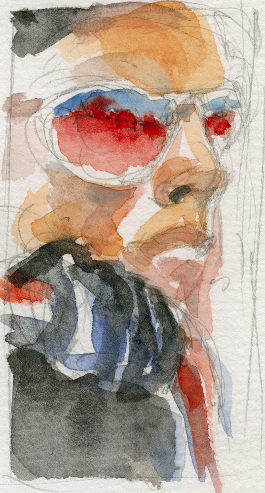
An early sketch on the left shows the winemaker looking like Peter Fonda on the "Easy Rider" poster. Though the direction of the label changed significantly from the initial sketch, the distinctiveness of the image and its ability to capture "red, white and blue" as well as the defiant spirit of the film, made it a strong first step.
We had a discussion about copyright and I talked them out of using "Easy Rider".
The search for a new name began. It was my suggestion that we use "Manifesto!" From there it seemed natural to state their manifesto, front and center. The energy of the initial sketch is carried over to the calligraphy. The custom red made this package leap from a retail shelf.

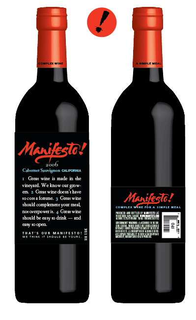

The branded image carried over to custom Stelvin closures and cartons. I revamped the colors for the Cabernet Sauvignon.

This was a successful brand for many years.
The custom calligraphy was created by Melissa Titonne of Words of a Feather.
